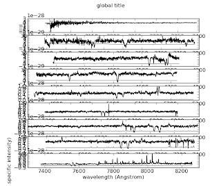
Alice kindly showed me how to plot a multi-panel figure, in this case, a long echelle spectrum. Thanks, Alice!
import sys
import os
import pylab
inE = 'infile.txt'
Npanels = 9
fig = pylab.figure(num=1) #from matplotlib
# loadtext actually comes from numpy, which pylab has.
wavelength,flux,sigma = pylab.loadtxt(inE, comments="#", skiprows=3, usecols=(0,1,2), unpack=True)
length = len(wavelength)
for i in range(0, Npanels):
format = Npanels*100 + 11 # makes label: 311 for 3 rows, 1 col, start at 1
pylab.subplot(format + i)
start = i*(length/Npanels)
end = start + length/Npanels
pylab.plot(wavelength[start:end], flux[start:end], 'k')
pylab.plot(wavelength[start:end], sigma[start:end], '0.5')
pylab.xticks()
pylab.xlabel('wavelength (Angstrom)')
pylab.ylabel('specific intensity)')
pylab.suptitle('global title')
Tada! pylab.subplot is a really powerful command. What's more, I can interactively adjust the size, aspect ratio, etc of the resulting figure, and save it, without needing separate presets for screen and file.
Wow! I'm starting to see why people love python.
How do I OUTPUT a figure?
ReplyDelete